- Untraditional layouts as the titles are at the bottom of the page with the main image in the 'Scream' poster being an extreme close up of the main character looking shocked. In the 'Panic Room' poster we see a close-up of the main character at the bottom of the page which doesnt follow the codes and conventions of a traditional poster setting.
- Main character is usually in the center of the poster as this is the main attraction of the film for fans, target audiences and customers wanting to buy the poster in shops.
- The posters are always striking, so when seen on buses, in bus shelters or outside a cinema they are immediately appealing to an audience creating a sense of curiosity.
- Main image is usually the most shocking and powerful image as it creates interest within an audience. Interest is also created by using well known actresses and actors creating more publicity and advertisement for the product.
- Colours used in the three film magazines gives the audience an overall feel of the film that is being advertised whether its a sci-fi thriller, or an action shot out thriller. The use of props also contributes to this feeling such as the cover containing Leonardo Dicaprio where we see him dressed in a suit with a weapon behind his back suggesting the film will involve a lot of action shots of chase sequences. Codes and conventions of thriller/horror films are used in this magazine with the use of dark colours to give the audience an overall spooky feel to the film.
- The USP for a film magazines is the same for every genre of film, with it being the main character as they are nine times out of ten of great fame with success from past projects which intially creates a huge fan base.
Sunday, 31 October 2010
Research findings from Film Magazines and Posters
From the posters I have researched I have found:
Findings from Thriller Film Trailers
- Music begins slow, creating a calm atmosphere. A scary and gloomy atmosphere is then created with the music becoming faster and faster also with the introduction of high pitched stingers which are seen in the creep film trailer below.
- The music helps build the plot as it reaches its climax with the most scary aspect of the trailer.
- As seen in the trailers analysed below, the victim is always a woman as they are represented as weak and vulnerable.
- We see a mix of emotions in each trailer as the characters at first seem calm and as the trailer goes on this emotion turns into worry, desperation and crying.
- In most thriller trailers an enigma is created as the unknown is never shown but always appears somehow in the trailer, which could just be its hand of part of its body as seen in the creep trailer.
- Some of the narrative is given away so people want to go and watch the film, but not enough as to give away the whole plot.
- Isolated settings such as train stations have been used with the contribution of dark colours.
- A weapon such as a knife is also shown which is seen as threatening and initimidating to the audience.
Techniques used in thriller trailers
- FREYTAG’S PYRAMID (plot structure)- rising action (layers of mystery building), hits climax (turning point/highest intensity), then falling action (pieces of the puzzle fall into place() – after conflict has been resolved.
- Used in
Hollywood film trailers. – striking feature - Quiet opening leads to a punch in music, following action.
- Action cools down, with quiet sound and credits at the end.
In order for our film trailer to achieve the highest possible mark, we have based the plot around Freytag's Pyramid for it to follow a good structure.
Research findings from the Thriller Genre
The idea of a thriller is to keep the audience at the edge of their seats in anticipation and to promote intense excitement, anxiety and nerve-wracking tension. The only rule of a thriller is to provide thrills and the plot builds to a climax. To build this suspense, tension building music is used and camera shots are fast pace with quick cuts. There is a lot of camera movement involved. Camera shots are usually point of view shots or close ups. In a thriller audiences expect to see a cross genre between thriller and action/adventure, so producers put this in inorder to attract their target audience. Codes and conventions of the Thriller genre play on stereotypes such as female characters playing the victim and they are stereotypically vulnerable and weak, whereas male characters are represented as strong and powerful that is why therefore the male characters kill the female characters. Also, Thrillers are usually set in a city or quiet country village, urban or isolated suburban settings. This is due to the theme of horrors surrounding isolation but also, murder, pain or terrorism which are some of societies worries or fears. Low-key lighting is used to create a spooky atmosphere but also to create shadows which can hide parts of a character and can also emphasis the unknown. Most thrillers are set at night time as they same affect would not be created if scenes were filmed in the day time. Props are used such as weapons like guns and knifes to make the audience feel threatened. Colours play a big part in the codes and conventions of a thriller as they can signify an emotion of a character or a situation, for example when red colours are used in thrillers/horror films, they signify danger or blood.
Saturday, 30 October 2010
Magazine Front Cover Analysis

- The magazines title is featured at the top of the layout in big bold lettering, showing its importance in terms of marketing. Contrasting colours have been used to catch the audiences attention, as a way of advertising the product. If it stands out, people are more likely to take an interest in the product and therefore more people end up buying it.
- We see the main character (main image) pictured centre of the magazine showing this is the most important feature. This picture normally contains a shot from the film to also generate interest to the upcoming film and engage a wider audience. So film magazines in general attract only the readers of the magazine and people who are interested in learning about films. We see the main image pictured all in black giving the character a dark, but mysterious feel to him. The fact he is holding two guns immediately gives away the genre of the film and suggest the character could be involved in a chase or some kind of violence.
- This bar code is presented on every film magazine, with the price usually beneath it in order for the product to be sold. We see the gun pointing towards the audience making us feel tense and intimidated. This also shows the character to have power and authority as he is handling deadly weapons.
- The use of a famous actors name can engage fans of the actor and further promotion of the film. This creates high expectation for the film as if his previous projects have been of a high standard, the current project should follow that. The makers of the magazine have used an attractive, well-known actor in order to manipulate a female audience into purchasing the product.
This part of the magazine contains extra information about other features in the magazine which could also attract a wider audience as if they aren’t engaged by what is on the front cover, they may be engaged by the information inside.
- The USP of this magazine is that the main image is a well-known actor encouraging an audience to purchase the magazine as a high expectation level is created from this. The image created by the magazine, suggest this film to have a sci-fi, or space theme to it with elements of horror and thriller.
Analysing Magazine front covers: Spiderman

- Traditional magazine layout with main image in the centre to attract an audience passing by. The image is surrounded by other items featured in the magazine which will attract when being previously attracted to the main image. So if the main image doesnt encourage a particular audience to purchase the magazine, then features contained inside it might.
- Another advertising technique used to market a product is that the most powerful image is pictured on the front of the magazine to attract the audience the magazine is targeted for.
- Spiderman's hand gesture that is pictured is an iconic feature in the film which he followers will recognise. It is almost as if he is inviting us into his world and making us feel a part of the experience. He is also a well-known character as Spiderman is part of a franchise, with past movies being successful, so this creates a high expectation level for an audience and automatically this causes a lot of publicity and advertisement for the film. It also attracts fans from previous projects, and new fans due to the success of past films. The hand gesture could also suggest hes trying to pull the audience in and invite them into his world.
- The word 'FREE' appears on the magazine in big bold letters which catches the audiences attention as we love freebies. Also due to the current economic state, free things are hard to find so when something is free it is instantly appealing.
- Codes and conventions of the thriller genre are seen in the use of colour scheme on the magazine using colours such as black, red and white. These are all powerful colours to use in terms of connotations of media as they each create a distinct meaning.
- The USP of this magazine, is that the actor is recognisable to a large group of people, immediately encouraging them to purchase the magazine, so this is how Empire magazine manipulates its audience into buying it. The magazine could also appeal more to a female audience as it uses an attractive, well-known actor to build an audience.
Analysis of Magazine Front Cover: Inception

- A traditional layout is shown as the main character of the film is centered in the front cover with other items included in the magazine around the image.
- A well known actor is used as an advertising technique to sell the magazine, as this will appeal to fans of the actor from previous projects and fans of the genre. It is also targeted at women as Leonardo Dicaprio is a very good looking man, so women are easily drawn in than men. This then makes women more likely to go and pay to watch the film.
- The use of dark colours could signify the genre to the audience as we see the main character dressed smartly in a black suit with a darkish blue background making him an eye catching and authoritive figure on the magazine. The colour schemes used creates a spooky and supernatural feel with the use of black and dark musky blue. The blue background could suggest connotations of sadness or coldness involved in the film. The use of the knife could also show the genre of the film suggesting the main character to be deceiving as although he looks intelligent and wealthy due to his costume the use of the weapon suggests he could have a dark of evil side.
- The text pictured around the main image is seen in colours red and white which could suggest a battle between evil and innocence which could show the use of binary opposites in the film such as the victim and the killer or the known and the unknown. The colour red could also suggest there is danger involved in the plot and could act as a warning to the audience.
- The main character seems to be looking past the camera with a worrying and guilty facial expression showing he may have done something wrong, or be in trouble.
- The text around the outside of the main image may also encourage an audience to purchase the magazine as it includes an article on 'Toy Story 3' which could be appealing to a younger and family audience.
- All the codes and conventions used in this film cover suggests the film 'Inception' could be a Hybrid film with a mixture of both horror and thriller elements.
- The title of the magazine 'Total Film' looks as though it has been made out of buildings which would normally be located in a city, showing the genre of the film as action packed thriller sequences normally take place in big settings such as warehouses and cities.
Mood Board
We created this mood board in order to help us with our secondary research into film posters as we will eventually be making one. As you can see in almost every poster we see a close up of the main character (main image) which we will take into consideration when making our own. There is also a use of shadows, low-key lighting and dark colours which are common codes and conventions used throughout this genre, which we will also take into consideration. Another similarity is in the majority of the posters the title seems to be under the main image maybe showing that the main image is aimed to be the main attraction and the title of the film is the secondary image and should be noticed next.
Analysis of Creep Trailer (Repitore of Elements)
Creep was made in 2005 and is a British horror/thriller movie directed by Christopher Smith. It follows the story of a woman locked in the underground at night where she is followed by a killer living in the sewers below. The video above is the teaser trailer of the film, lasting just 1.45s. The trailer is quite short so quick cuts and fast paced shots are used including lots of action and therefore creating a greater impact on the audience, due to so much happening in the trailer. The film is a Hybrid film as it combines two genres and in this case it is the horror and thriller genre, as it includes elements from both genres.
The trailer starts off with point of view shots and heavy breathing from the main character who we suggest is a girl going down the escalators on the underground, this automatically creates confusion and an enigma as we wonder why is she scared? Point of view shots are used in this trailer so we are able to understand and connect with the character as we are seeing exactly what she is seeing. She then begins to scream which makes us jump and feel intimidated having us at the edge of our seats as we are then expecting something to happen due to her reaction. As this is happening there is an introduction of stingers and high pitched music, building the tension as the action begins. The music creates the mood for the audience as a tense and paranoid mood is created. An isolated setting is used to have this effect on the audience, as no one is around and therefore no one can help her. This is a common code and convention of the horror/thriller genre as it allows frightening sequences to take place as there is nothing or no one around to stop it. The trailer is set in an underground station in London, and this is therefore the films unique selling point also due to the fact this film was a British success.
Mise en scene used in the trailer includes scenes in the underground starting off going down the escalator, then looking onto the train track. The first victim killed by the unknown killer occurs on the tube as the last train arrives but does not go anywhere, this is the first occasion where we see the main character panic, and we therefore begin to panic for her. Elements from the horror/thriller genre which are seen and repeated in most horror films such as the last girl are featured in this trailer as we assume that she survives due to all horror movies following the same rules. There are also binary opposites used in genre such as the victim and the killer. Audience for this film would be older teens due to it being a certificate 18. This is not a family film due to the blood and gore, but applys more to a male audience. The narrative device used in the trailer is the unknown/killer which the main character must overcome by escaping safely. Iconography is used as we seen the unknown/killer holding a knife, this is seen in most horror movies as it is a way to represent the genre so it can be recogniseable to the audience.
Titles in the trailer are made by the use of editing also using sound effects at the end when the title of the film appears. After each few shots have been played, a subtitle will come up which the audience then have to read making them feel more involved. At the end of the trailer, an enigma is created as the last shot pictures a persons arm with a long knife which makes us question his identity, he reasons for killing people, and if the girl survives.
http://en.wikipedia.org/wiki/Creep_(film)
Sunday, 3 October 2010
Research into Genre: Poster Analysis
THRILLER: When a Stranger Calls

In this poster we see the main image is a woman pictured in the centre left third showing us a common code and convention of the thriller genre. She appears to be fearful and desperate which enhances her vulnerability and suggests she is in trouble. This indicates to the audience she is the victim in the film. This creates an enigma for the audience as we want to know why she appears this way and what will happen to her throughout the film. We see the female characters face is holding a phone as if to call someone for help. Her facial expression also suggests she could be in danger. The secondary image shows a shadow lurking behind the main image and we want to know what role it plays and due to the secondary images outline we automatically assume the shadow is a man which could be due to the stereotypes we make as in most thriller/horror films the man plays the killer and the woman plays the victim, therefore this is what we expect to see in every thriller and horror film as they seem to play on these stereotypes. Typically women are stereotyped to be the victim to a dominant male character due to them being dependant to the more powerful sex. She is pictured staring straight into the camera connecting all her emotions with the audience and we therefore feel her fear. A thrillers intention is to play with the audience’s mind, to keep them guessing and in suspense. Another convention of the thriller genre found in this poster is the shadow in the background as it emphasises the unknown and shows the cross genre between action and Sci-fi. He creates a sense of mystery as we are unaware of his intentions and suggests the female character is in danger.
The colouring of the titles starts light and catches the audience’s attention as it contrasts with the black background. The titling then starts to darken in colour which could signify the journey the female character is going to go on as at the start of the film she is unaware of her fate as she will become the victim. This film poster follows the repertoire of elements as we see identifable characters such as the last girl standing who usually throughout the film battles through every challenge she meets, shown in the main image. This film would interest mostly adults and older teenagers due to their being an intellectual element, as there is a certain amount of individual thought needed as a thrillers aim is to make the audience unravel a certain mystery. These kind of films can be classed as intellectual puzzles as they strive to keep as much of the plot as possible with an unexpected twist at the end of the film. The poster shows binary opposites that can be found in genre, this one for example shows a killer and a victim. Other genres such as teen comedy shows the nerd and the popular kids. Iconography is used in the poster as we see a shadow which immediately tells the audience the genre of the film, other iconic features in this poster could include the main image which shows the woman looking scared, useless and vulnerable. A narrative device is used in this poster, something that every film does, it is the narrative problem that is eventually overcome by the end of the film, in this case it suggests it is something to do with the main and secondary image as it is suggests the problem in the woman's life is the shadow like figure which must be overcome by the end of the film.
Panic Room
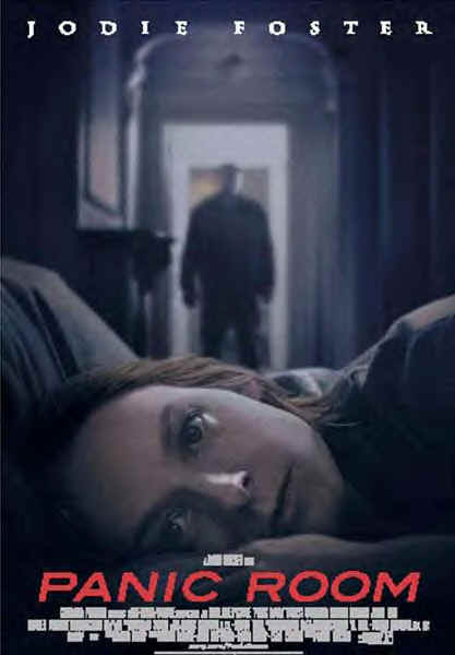
The first thing that catches the audience’s attention is the main image which is the women’s face pictured in the bottom centre third of poster where she seems to be dead. This is a shocking image making the audience feel intense and confused. This is a strange but striking layout as it is unusual to have the main image placed at the bottom of the poster as the layout of a poster normally follows the same rules or structure, this therefore stands out to the audience. It draws the audience and also creates an enigma as we we want to watch it to find out what happened to the female character and if the male character in the background has anything to do with her death. The male character pictured in the background is dressed entirely in black suggesting to the audience he wants his identity to remain unknown as he may have been the one that killed the female character, creating an evil and mysterious feel to the character. As he is pictured looking at the women it creates an enigma as we wonder if he had something to do with her death or even murdered her.
The title ‘Panic Room’ is coloured in red and acts as a signifier of danger which contrasts with the actresses name ‘Jodie Foster’ which is coloured in white to suggest her vulnerability and innocence. The effect of having the famous actresses name on the poster is to attract fans of her previous projects, but also influence other people to watch it as she is a well known actress so audience expectation of the film is high. This is the films unique selling point (USP) as it uses the well known actress to advertise and promote the film so more people will pay to watch it in the cinema. This poster plays on the codes and conventions of the thriller/genre horror as women are stereotypically the victims as they represented to be weak and vulnerable as we see the female character is pictured looking like shes been killed. This plays on another rule of the thriller/horror genre, that female characters or victims get killed off before the end of the film. This poster represents the world as scary and intimidating place to live in as the man in the background makes us feel immediately threathened and the fact that we cannot see his identity gives off a mysterious feel. It doesnt give much away about the narrative but tells us that evil defeats good as it looks as if in the poster that Jodie Foster's character is dead and we assume this was carried out by the man who we cannot idenitify in the background. By not giving away any parts of the storyline it makes us want to go and see the film, which could be any advertising technique used to draw the audience.
Subscribe to:
Comments (Atom)